CAGD 270
CAGD 270 Level Design
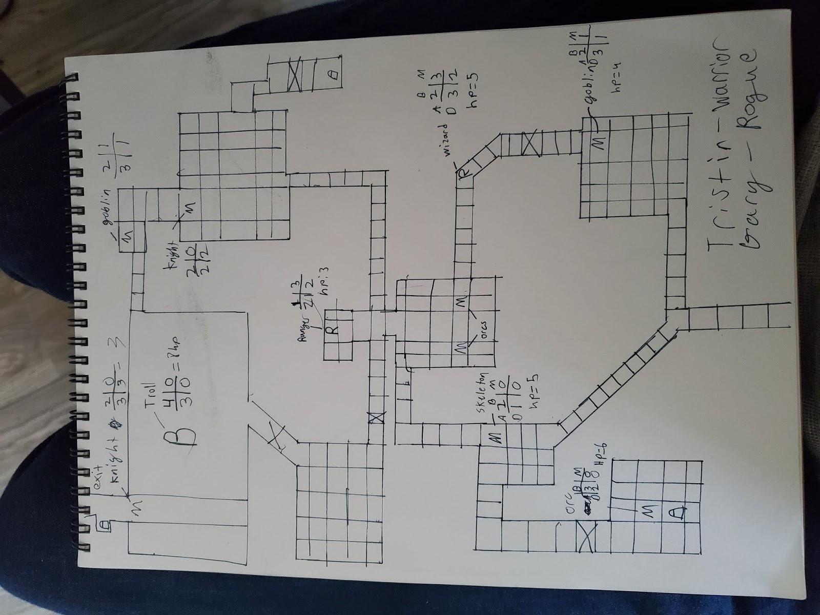
Simple DnD map Feedback 2-11-20
For this assignment, we were tasked to create and draw out our own maps out of the several different components of level design we had learned in the lectures. When I had playtested my DnD map I had gathered 2 players other than myself and also playtested their creations, however I will be focusing on my map for this post. The two players who went through my map were, Tristan and Ragalla. Their chosen classes in this specific playthrough were warrior and mage.
There were a specific few things that went right compared to other components of my map. For one, my map was fairly diverse and included the use of many different alternate routes in order to reach the boss room and escape the dungeon. Also the placement of the different enemies on my map usually caused many instances of forced conflict, more commonly within the middle of the map. I also saw that they seemed to notice the linear path of the level fairly easy, allowing them understand which direction they were needing to go. I was also told that there was a relatively good balance of pitfalls and enemies which helped push the player to the objective. Lastly, rewarding the exploration of the less relevant side of the map was something they seemed to appreciate.

There were also several improvements that could be made to the game. Firstly, the map itself was physically drawn which made it a bit more difficult to organize compared to a printed map. Since I drew the map by hand its easy to tell in the picture how uneven the moving spaces may be in certain parts of the map compared to the uniformity of a printer. They were too small for the avatar which made movement around the map slightly disorienting for the players. One last bit of feedback that I didn't take into consideration when drawing my map was the limitations of sight on the ranged enemies on the map being usually 3 spaces, I actually had placed them in positions with the idea that their range was essentially unlimited.
The first thing I could do to improve my map with the feedback I had collected would be to switch from a hand drawn map to a printed one. This of course would lead me to change the size of the spaces within the map and the spaces in which ranged enemies would be placed. I feel as though the overall layout design of the level was more accepted than other components; therefore I won't change it drastically but rather subtly to accompany for my better understanding of the rules.
I felt as though the challenges of the level were presented appropriately for the introductory nature of the level by forcing the player into different sorts of conflict. Not only through enemies but also through obstacles which were pitfalls placed 'strategically' throughout the level making sure the player understanding their mechanics. Overall when taking a look at the linear path of the level its fairly easy to see making it obvious for the player. Although there are alternative routes, the player could still easily see the end goal leading to the same boss room and exit point of the map. Also considering the fact I implemented a route which rewarded players for exploration gave it a bit more diversity for the player in my opinion.
The overall flow of the game was relatively smooth considering the somewhat disorganized spaces on the map and weird placing of the ranged enemies. I believe there were circulation elements to this map, especially considering almost every path on the map looped around connecting with itself in a couple of different areas.
In conclusion to my first playtest, the main purpose of this map was to teach the player the overall mechanics of the game while keeping the difficulty fairly reasonable and I feel this goal was reached. However, I do believe there are a few more elements that could definitely improve the players experience on the map which I will be putting to another test soon.
Simple DnD map Feedback 2/18/20
In my second play test of the map I had changed quite a few things with the map while keeping a majority of the main points that kept its uniqueness. The people who played my map were, Tristan and Gary. Tristan had decided to play as a warrior and Gary decided to play as a rogue. In this play through I had noticed that the time it had took to get through the map was much closer to the time we were given which was around 20-30 minutes per map. On my last map it had actually taken a bit quicker to get through the map since it wasn't as planned out.
With this map there were many things that went right with it compared to my first feedback play through. For example in my first play through I was missing any enemies on my map and I had to actually borrow a few enemy cards from my peer. However, in this one I had actually came up with my own monsters and different statistics for them. One of the main problems about this was how overpowered I had actually made a few of the monsters. For example since the wizard enemy I had placed in the map was too powerful I had decided to "revive" the player giving Gary a second chance to continue playing after seeing what it was that caused that being the stats I gave it.
Another thing that I was told went well in the map was the good bottleneck events that I had placed in the beginning of the maps in order for the player to learn how combat worked early on in the map before reaching the boss area. I was told how they enjoyed the forked path at almost every cross section on the map giving the player many chances for personal choice and a sense of freedom. In short, although some monsters were balanced, some clearly weren't not only being the wizard but as well as the boss who managed to one hit Gary twice in the play through. So in my opinion the first thing I will do in order to change the map and improve it would have to be through creating a more balanced boss and enemies along with creating a better loot system in order to keep the player engaged in exploring and playing the game in general.

I believe other the challenges were presented fairly considering the introductory nature of the level apart from the fact that one enemy was unrealistically hard to pass by. as shown above. In terms of whether the critical path was obvious I believe it wasn't, however that doesn't necessarily mean the player didn't know where to go. This is mainly because throughout this play through I had tried something different that I had seen in other map creations, a fog of war effect (limited visibility). This limited visibility had helped add a sense of suspense and excitement for the player. while I did give the player many opportunities to explore in this map going through the map will always lead the player to the end so regardless of them knowing where to go it's always usually going to be the right path. The flow of this map seemed to be much more seamless than the last map considering it was more organized with the square spaces and overall proportions of the map.
The circulation elements were fairly similar to the first map since nothing was drastically changed, there are still areas of the map that you can revisit and circle back towards given the layout being filled with intersections in order to allow the player different opportunities for exploration. Overall I believe these rules and mechanics were taught to the player fairly and progressively gets harder throughout the level. Perhaps more in some areas than it should be yet that will be something I correct in my next map creation process.
DND Map Feedback V3 2/25/20
The people who played my map were my roommate and my friend, Ryan and Lance. I had decided to get more feedback from people who have never played any of my maps and were rather unfamiliar with the expectations of the map because I felt that was the most effective way of getting feedback which I believe it was. Ryan picked a ranger and Lance picked warrior. With the theme of the map being post apocalyptic with a prison layout I found it rather difficult compared to my other maps to give the player a better sense of exploration and freedom. This obviously fits with the theme however, with a prison layout the first factor means it will probably have to feel somewhat constricting to the player with minor bits of exploration.
What went right with this play test was what I initially had imagined it to be, I was told that they enjoyed the fact that they were forced into conflict given the amount of free roam the player has around the map. Although they were able to roam around in certain sections of the map it always led up to the series of events all players must go through to progress on this map which is going to the Control room or CR on the map in order to release the lock to enter the boss/final area as well as every other lock on the cell doors. They mentioned they enjoyed that series of events mainly because it adds a lot of tension where there seems to be missing some with all the doors to the enemies locked. Also the enemies that I had created on index card for all the different monsters on the map were much more balanced than my previous versions, they had their uniqueness to the map as well allowing the player to understand the theme a bit better.

What went wrong with this play test was the fact that although there was a sense of conflict and tension after they pressed the switch the time in between then to get to the switch was rather almost pointless. Because the only way that is allowed to progress on this map is going down the main hallway to press the button. This almost made the entire right half of the map somewhat irrelevant to the player as they just wanted to beat the level without exploring much. I found it a bit harder to reward the player without forcing them into exploration of the different rooms and cells of the map. Also considering the few rules that were taken out of the game it made my map much more symmetrical given I didn't have too many corridors to place pitfalls. Also I was told that the enemies were rather awkwardly placed throughout the map since the player didn't encounter them often it made the player wonder if they were even on the map if they took a certain path.
The way I would improve my map would have to be starting with the overall layout, the symmetry of the map gives it a much more predictable play through which takes the suspense away from the player. Next would to add more instances of conflict before the button switch event and perhaps a better placement of chests that were only placed in the prison cells since I didn't know where to place them initially. The challenges were definitely presented appropriately given the introductory nature of the level however it may have been too easy with no challenge in certain areas of the map. The critical path wasn't initially obvious to the players however after they discovered the map more and more they eventually had realized what it is their objective was to do. The circulation elements presented in this map were much less apparent than my last map being that the only cross section on the map was in the middle giving the player a set of options on where to go. Perhaps adding more and placing them in better positions would have benefit my map. I believe the rule mechanics were taught to the player in the best way I was able to do given the change in rule set.
Mega
Man Level v1 Feedback March 10,2020
When creating my first Mega Man Level I found it to be a
bit difficult to think of ideas in the beginning of the level; however as time
passed I began to find it much easier to focus any ideas on the 10 different enemies
just by first simply understanding how the enemy functioned. Once I had figured
this out as well as keeping my ideas tied to a certain theme, it made the rest
of the level much easier to create. In my first play-test I honestly didn't
expect to get as much feedback as I did, it was good feedback because it had
shown me the errors in my level I didn't see with my own eye.
Beginning on what went right with the level, the
play-testers had told me that the level had a good balance of enemies to health
pickups, also that the layout of the map was fairly creative given the limited
amount of tools to create it. The fact that the map had a lot of vertical
movement to it made it much more interesting than the standard one platform
side -scroller. This ranged from underground areas to areas high in the "sky" of the
level. There was more feedback about
what went wrong with the level. To begin with the start of the level the first
enemy was actually placed at such an angle that the player could not easily
shoot it without perfectly timing a mid-air shot as shown below.

Soon after this it was clear that the next
issue was the enemy selection since the next enemy placed right behind the
first was an enemy that had too high hp for the beginning of the level. Then
near the middle of the level where water was introduced in small pools the
player can jump in, there was a hole that allowed the player to jump out of the
intended play area.

Although this was an intro level I was
told I had made it a bit too challenging given it’s supposed to have a more
“tutorial difficulty”. Other than this there was a certain part in the level
where I had made the spacing for a jump between tiles to be one tile too wide
making the jump very difficult for the player, I had fixed this easily in the
editor(below). In that same area a flying enemy flies over and seems almost
impossible to defend against infinitely spawning(below). Also the fact that
enemy spawns were infinite which there is no setting I had seen for, it made
the experience of killing the enemies less rewarding. The way I believe I can
improve this game is to start by correcting the tile errors for the jumps and
the placement and height certain enemies stand infront the player, also adding
a bit more variety with the enemies in order to decrease the difficulty. Next I
believe there will always be room for expanding the current map as it is,
keeping in mind the sliding mechanic I had forgotten to implement and teach
within the level.

The critical path of this level should’ve
been fairly obvious for the player given it has a very linear structure. The
only variation in direction I had given the player was the option to go below
or under a given obstacle. The overall flow of the game was relatively smooth
however the player did die quite a few more times than I had anticipated. In
conclusion there was much to learn from this particular level, and I believe my
updated version of the map will be much more friendly than this with the
implementations mentioned above that I plan to make.
Mega Man Level V2 Feedback March 26, 2020
With the second version of my first Mega Man level, I had decided to change numerous different things throughout the level. Beginning with the tile placement in the beginning of the level as well as toward the middle where there was a jump that was very difficult to make. Along with the tile placement throughout the level I had decided to remove a couple of the harder enemies and replace them with easier enemies that suited the intro style level. Not only this but also adding brand new enemies that the player hasn't experienced yet.
When taking a look at how the play tester went through my level there was significantly less complications than the first level I made. First of all, in my play-tester's words it was a lot cleaner than the first version of the game. It was also said that the game had much better pacing than before along with similar feedback such as good utilization of the moving platforms and placement of enemies. The level itself also does a well job of teaching the player how to use the different mechanics of the game. A good example of this shown below is the part of the level I added which forces the player to use the sliding control in order to progress further into the level. One thing I had also realized was that the enemy I had placed above this passage wasn't behaving correctly. It should shoot a projectile at a diagonal angle downwards however it doesn't react to the player unless it jumps nearby and when it does the projectile is already very far behind the player making it irrelevant to the player.

The things that went wrong with the level were much less apparent than the first version. For example I had realized even after I removed some enemies and added a few others, the health packs seemed a bit scarce throughout the level. Making the level very difficult to complete in a single run through without dying. Also another problem that I had experienced in the first version was odd camera angles when progressing through a certain part of the map with platforms. This part of the map shown below shows the edges of the screen, so as the player crosses over the camera is focused directly on that certain section of the level.

The way I believe I could improve this level would mainly be through better placement of enemies and health pickups. I felt as though the tiles were placed very well throughout the map however the spacing of certain enemies made avoiding damage almost impossible in some scenarios. In my opinion the challenges presented in my level seemed to be much more appropriate to the skill level of the player compared to the first level. The critical path was obvious in my level even though I had given options of different areas to explore throughout the level such as the image below with a underground section that had a health pack which also allowed the player to pop behind one of the tougher enemies shown below. Although I haven't changed this part of the level specifically for my second version, it does give a good example of giving the players different options to choose from when exploring the level.

The overall flow of the level was described as fairly smooth, with good transitioning between the different settings of the level, for example from ground level to the sky to the underground level. The path seemed fairly obvious to the player as to where they were supposed to go, although I did give them the option to go different directions. In conclusion the level now needs minimal work done to it in order for me to call it the "final draft", things along the lines of adding more health packs throughout the level as well as fixing the constant re spawning of enemies when they leave the players field of view.
Megaman Level 2 Feedback
When creating my most recent level in Mega Man I have to say that I definitely spent the most time on this level compared to all my other levels. Especially considering the fact that in the first Megaman level I was limited to using only the M.Buster weapon. In this level we were allowed to use two new weapons with the goal of teaching them to the player in various different scenarios throughout the level. In my level I used the S. Arrow and O. Slider. The S. Arrow was a makeshift platform/weapon with a limited tine frame before destroying itself, and the O. Slider was a weapon you could shoot a puddle of oil and slide on it to navigate the level faster.
To begin on what went right with the level I was told by my play-testers that the uniqueness in the level really appealed to them. this is also including the different atmospheres I provided for the player including the jungle floor, tree tops, caves, and the river. I tried my best to implement as much verticality to my level as possible to add to the replay ability which I believe I achieved because the play-tester decided to go through another play-through after beating the top most part of the map first.
I was also told that certain parts of the level were fairly informative, especially the ones including the weapon blocks for the S.Arrow. as shown below. Apart from this I was told that I had good pacing throughout the level, even though it didn't entirely reach the 10 minute mark when played through perfectly this didn't seem to matter because none of the play-testers seemed to make it through the level without making any mistakes.

Although these weapon blocks were informative to the player in the beginning of the level it didn't seem to make sense to the player when posed with similar challenges closer to the middle of the level. This is shown below in the middle of the level where I posed a challenge for the player where they were supposed to use their S.Arrow in order to scale a wall. Even though the player was shown how to scale a wall in the beginning of the level they still seemed confused without the weapon blocks.

Also near the end of the level where I Implemented an area where the player was forced to use the oil slide mechanic, the player didn't seem to understand how to use this mechanic. It eventually came to the player after a bit of experimenting with the oil slide. My intention was to create the entire middle part of the level strictly for the oil sliding mechanic.

Another part of the level the player had a bit of frustration with was the platforming area past the "surfing" area. This part seemed to be the most time consuming part because the moving platforms weren't synced up with each other, therefore the player had to sit for a longer time than anticipated on each platform. This part is shown below.

The last part I noticed an issue with the game was in the middle of the level where the player was able to bypass an oil weapon barrier shown below. This was mainly because I tried to add a bit more immersion in the level by adding physical "branches" to the background trees.

Overall however the main path wasn't that obvious to the player since I offered so many different options to the player. However the flow seemed to go very smoothly throughout the game. All in all I have plenty to fix with this level and will look forward to getting more feedback in the future.
3D Game V1 Feedback 4/15/20
Before my play test began there were a couple things I was having issues with when creating my level. Firstly it was the counter we learned about through the unity tutorial for the game kit. Although I followed all the directions, in my game it was still working incorrectly. The counter is basically described as a counter for the amount switches required to open a door in unity. For my specific situation I used the counter for 3 switches and they wouldn't work so I had to open the doors beforehand for the player.
When the people I chose play tested my game I noticed a few different things that went the way I intended it to. Firstly the players all understood how the switches worked after the very first instance of the switches, however they didn't seem to understand what the crystal above the door was as shown below. Something else I noticed that went fairly well was their understanding of the differences between the enemies. This is mainly due to the placement of the enemies as mentioned by the play testers. Another thing that went well was the players understanding of the different mechanics of the game throughout the level; including the moving platforms, pressure pads, combat mechanics, and the movement.
What went wrong? There was a bit more complications I only noticed with the play tests. Starting with the beginning as mentioned above the player was confused as to what the glowing green crystal above the door was there for, so they stood there and jumped around for a bit trying to "collect" it as though it were an item. It took them a bit but eventually they gave up, and later on in the middle of the level they realized that they correlated with the switches they pressed. There was also a chomper near the beginning of the level that I forgot to prepare.


Another problem I encountered was that the Acid pool's box collider was just above the level so when the player jumped too high it would kill the player. This also meant that the acid pool the player could fall in wouldn't damage the player leaving them to only restart the level. I also couldn't figure out how to make the acid to re spawn the player when they fall instead of only damaging them. Soon after this I began to notice that a few walls in the level weren't solid causing the player to walk right through them because I didn't set their layer to "environment". This is what caused the player to fall in the acid in certain instances.
Improving my level for the second version will involve a bit of a rearrangement of the level including solving all of the issues that I mentioned above. Accelerating the speed of the different moving platforms across the level would be a good addition as well since they were a bit awkwardly timed with the amount of waiting a player might have to do. I believe the challenges were presented appropriately to the skill level of the player. Although the level was meant to be easy it seemed easy enough to not consider it much of a challenge. However, some of the jumps between blocks in the map were a bit weirdly placed combing with the controls of the game, making it hard to time jumps correctly. This led to my play testers agreeing that the challenges were definitely presented appropriate to the skill level of the player. Once last but crucial element that would improve my level would be introduction of UI text to the player guiding him/her with hints.
The play testers did mention that the critical path throughout the level was rather obvious. The overall flow of the game was a bit slow paced however it got a bit quicker as they progressed. There weren't many circulation elements other than the few areas the player would walk across multiple times given the different directions of switches on the linear path.

Overall throughout the level it become progressively obvious where to go, especially on the 2nd floor of the level.
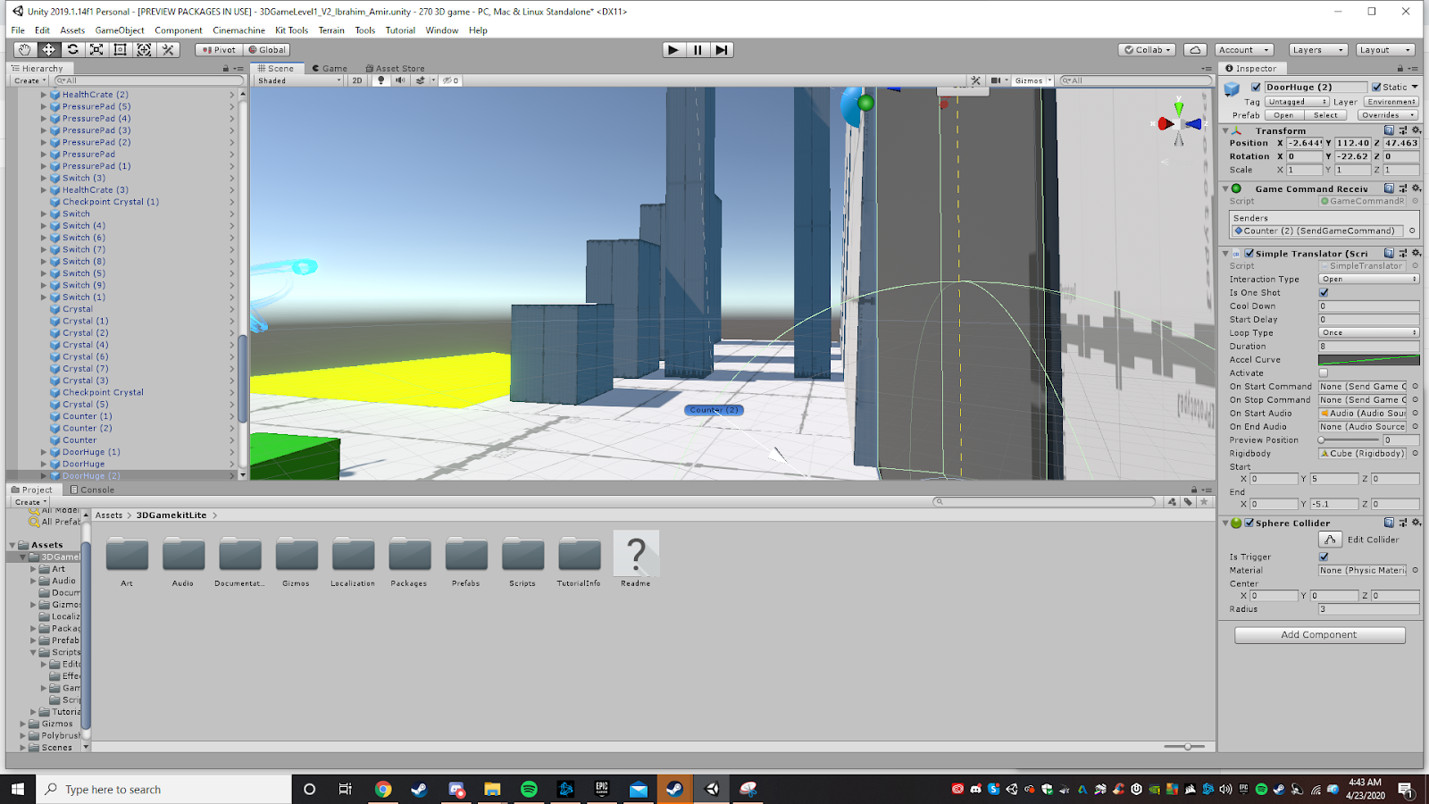
3D Game V2 Feedback 4/23/20
During my second play test of this level the play through seemed much smoother compared to the first. The first thing I noticed is just how much quicker the player went through the level. It seemed as though the player spent much less time pressing random buttons and figuring out how the game worked without any tutorial. Once I had added some UI text elements to give the player more direction it made it much clearer to the player, so they spent much less time trying to understand the game in their own way, but rather following the direction of the game. Some examples of the UI I had added are shown below.


Another major thing that really completed this level was figuring out how come the doors wouldn't open when the player triggered the correct amount of switches. This is the same issue that led me to leaving all the doors open in the first play test because I couldn't figure out how come they wouldn't work. I had found out that the problem was because of the order I had tried to create the counter. Even after I solved this issue I couldn't understand why it wasn't working initially. The way I fixed this issue was having the switch "send on trigger enter" interactive object not set to open the door before I replaced it in the inspector with the counter object. If I just created the switch and instantly set the counter to the interactive object without making sure it worked by opening the door it for some reason wouldn't open the door.


One last flaw I noticed during this play-through was just how buggy the enemies were when moving around on the platforms they sit on throughout the level. I saw multiple times enemies falling through the floor only to sit on the bed of acid at the bottom of the map. Shown Below.

This most likely had a lot to do with the Nav Mesh Surface component I used earlier in the level to allow the enemies to move about on the different surfaces. I assumed that perhaps the enemies were just meant to be on the ground default with the level. Different things I feel like I could improve in this level would have to start with the acid lake's damage. So far it doesn't seem like a lake of acid especially when you don't get hurt by it. Something Else I realized would add to the aesthetic of the is perhaps some makeshift "mountains" bordering the map so it gives a better sense of the environment to the player and what is under them. Next would be the simple fixes with my level such as adjusting the angle of the climbable wall and correcting the mesh colliders beneath the enemies so they won't just fall off effortlessly. Last thing I believe I would add is a checkpoint beyond the first door before the 2nd checkpoint in the level. People seemed a bit frustrated to restart from the beginning of the level if they fell in the acid.
Overall the game was played much smoother with the critical path becoming even more obvious to the player compared to the first version of the game. The challenge was also presented to the player in quite an easy tone. The level didn't prove to be difficult for any of the players which is what my intention was.
3D Game level 2 Feedback 5/5/20
When creating the second level of my 3D game I found it a bit difficult to get an initial idea that would lead the game to have the 10 minutes of playtime, so eventually I thought of the idea to create a kind of open world map. With the end of the level being through the main door down the middle. It gave me the opportunity to allow the player to explore the map shown below.

As you can see I've essentially created two switches to open the main door on the map that leads to the ending of the level. One of the main things I first noticed was going to be an issue was the lack of resources for creating a jungle themed map because the only building blocks given were white. Therefore I had to add my own materials along with a few basic material colors. This seems to have added to the experience for my play-tester because they appreciated the environment a bit more given that there were custom textures in there giving a better sense of the environment's theme. I used Maya and substance painter in order to get these textures. Shown below is one of the textures I created for a cave themed section of the level.

One of the immediate problems I saw with the level was that the middle section of the level that contains the forest got little to no attention because it seemed as though the player never saw a reason to enter it. Especially since there was only 2 real structures, both on either side of the map with the switch. This definitely shaved off a lot of time since the player skipped around the biggest area in the level. Shown below is the chomper I created and enlarged with the most hit points in the map. So in order to progress to the end the player is forced into conflict.

Shown Below is the beginning of the cave section of the level. There were many enemies however they wouldn't notice the player unless he got too close. This made the player rethink their decision to run directly into everything.

One thing I had also noticed further on in the play-test was that neither of the checkpoints I set up were working properly so it somewhat frustrated the player since they get teleported to the beginning of the map. This was most likely due to me duplicating the checkpoints in the 1st level of my game.
One of the last couple issues that I noticed in this playtest was that the platform in the tree section of the map allowed the player to essentially skip half of the level leading the player straight to the switch to open the door as shown below. The reason for this was that I was placing too many circulation elements (moving platform) and placed one in the wrong way without thinking.

The last major issue I noticed was that the switches to the main big door weren't attached to any counter because I forgot to add one. Therefore either switch on each side of the map could open the door without having to travel between the two.
Overall I would say that the challenges could've been presented a bit better for the player, this made it a bit difficult given there are only 2 different enemies. In order to improve my level apart from correcting the issues above I would most likely add more variety in the terrain given the majority of the map is flat plane rather than having any vertical elements. However, when I attempted this using the terrain "Brush" it would only lift the vertexes of the levels floor, so only the 8 corners of the flat rectangle. Also rewarding the player for exploring the forest. The critical path was only obvious after the player explored a bit of the map however it wasn't initially in the start of the level.
Comments
Post a Comment